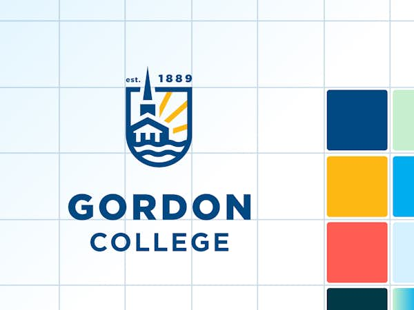
The following visual assets are for use representing Gordon's brand. It is important to follow the guidelines for each type of asset and never stretch, distort or otherwise customize brand elements.
Classy but casual appearance built on clean, structured and well-spaced layouts softened through intentionally placed curves, waves or rounded corners.
Thick headlines (Gotham Black or Amster Black) in sentence-case feel bold and friendly. Pair with thin lines, icons and supporting text (Gotham Book or Light).
Vibrant photography featuring our people and our place—ideally showcasing collaboration and community.
Navy is our anchor, but cyan is our shine. While dark blue is our institutional color, cyan plays a large role in our admissions and undergraduate personality and serves as an ‘action color’ on interactive pieces. The additional brand colors are intended to be used as accents rather than dominent colors.
LOGOS
The logo features the A. J. Gordon Memorial Chapel as a campus landmark and symbol of our Christian faith, indicates our coastal New England location and nods to the hope and potential our graduates bring to the world. The Gordon College logo should be treated as artwork and the space between the shield and wordmark should never be manually adjusted.
Below are logo files available for download. PNG files are intended for digital uses and EPS files are for high quality printing.
Centered in blue-gold
Download .png ➔
Download .eps ➔
Centered in blue
Download .png ➔
Download .eps ➔
Centered in white-gold
Download .png ➔
Download .eps ➔
Centered in white
Download .png ➔
Download .eps ➔
Left-aligned in blue-gold
Download .png ➔
Download .eps ➔
Left-aligned in blue
Download .png ➔
Download .eps ➔
Left-aligned in white-gold-
Download .png ➔
Download .eps ➔
Left-aligned in white
Download .png ➔
Download .eps ➔
Horizontal in blue-gold
Download .png ➔
Download .eps ➔
Horizontal in blue
Download .png ➔
Download .eps ➔
Horizontal in white-gold-
Download .png ➔
Download .eps ➔
Horizontal in white
Download .png ➔
Download .eps ➔
Learn to thrive - gradient
Download .png ➔
Learn to thrive - gold
Download .png ➔
Learn to thrive - white
Download .png ➔
This version is used in a few instances in which the final size is too small, such as in small digital applications.
Centered in blue
Download .png ➔
Download .jpg ➔
Download .eps ➔
Centered in black
Download .png ➔
Download .jpg ➔
Download .eps ➔
Centered in white
for use on dark backgrounds only
Download .png ➔
Download .eps ➔
Left-aligned in blue
Download .png ➔
Download .jpg ➔
Download .eps ➔
Left-aligned in black
Download .png ➔
Download .jpg ➔
Download .eps ➔
Left-aligned in white
for use on dark backgrounds only
Download .png ➔
Download .eps ➔
The institutional seal is a formal symbol that represents Gordon's heritage, quality and values. If you need assistance or additional variations on the logo not presented here, please contact the Design Center.
Seal in blue
Download .png ➔
Download .jpg ➔
Download .eps ➔
Seal in black
Download .png ➔
Download .jpg ➔
Download .eps ➔
Seal in white
for use on dark backgrounds only
Download .png ➔
Download .eps ➔
The Gordon College logo should always be situated in a clear, readable location.
When used in either state (wordmark or lockup with graphic) it should be allowed at least .25 inch of clear space on all sides.
The Gordon College logo can be scaled down to one (1) inch in width in both the seal and wordmark versions if necessary. Such a small size should only be used with proper printing to ensure readability. If such a small size is not absolutely necessary, a minimum size of 1.25 inches is suggested.
Only use the Gordon logo in the colors provided. There are subtle size differences between the blue and white versions of the logo to optically adjust for "irradiation phenomenon," where white shapes appear thicker to the eye than dark shapes. For this reason, never swap the color of the blue logo to white or vice-versa. Use the intended color from the start.
The Gordon College logo can be used over a photographic background, but only if it is clear and readable. When using the logo over an image, the single-color versions work best, particularly the white. The clear presentation of the Gordon College logo is essential to maintaining professionalism and readability.
COLOR PALETTE
The Gordon College color palette is made up of a primary blue that can be accompanied by color(s) from a secondary palette. Download the full color palette ➔
We have also compiled a collection of on-brand t-shirt colors for when groups on campus order t-shirts from a vendor. Here is our t-shirt color guide which shows the approved color choices for a few different brands of shirts.
TYPOGRAPHY
PRIMARY FONT
Gotham | Gordon College in Wenham, MA.
Gordon’s primary font is a strong and clear san-serif that works in a wide variety of contexts.
SECONDARY FONT
Amster | Gordon College in Wenham, MA.
A serif font that compliments Gotham with some added personality and flair to build off Gordon’s clean and modern aesthetic. Intended for use on headlines, callouts and accents.
PHOTOGRAPHY & VIDEO
Gordon strives to accurately represent our community through photo and video. To that end, we avoid stock images of students and instead work hard to capture our own campus and community through photo and video. When choosing photos, we look for authentic moments that illustrate collaboration and community. Gordon's photographic style is warm and vibrant, but not overly saturated.
Public-use photo catalog
Full internal photo catalog ("Portfolio" app, log in required)
Video B-Roll